KEMRYX Brand Identity
A name, a mark, five colors and two typefaces for a producer whose old name could not travel. Decided between late July and early September 2026, for a friend, and filed as a brand kit that reads as if the launch had already happened.
Context
Two aliases, one producer, one name that could not travel.
Tobi is a DJ and producer from Bavaria. He has been DJing since 2022 and producing since late 2023, and I have been cutting his videos for two years. His main alias, Latsge, has had regular releases since 2023. His second alias, L4TE, an Afro House project, runs separately and was not part of any of this.
In the summer of 2026 he decided to rename the main project. Latsge does not hold up as an international name, and a switch costs less while the audience is still small than after the larger label releases. The music does not change. The rename is a marketing decision, and it needed a complete identity behind it.
The setup behind the brand has two people. Tobi produces, films and posts. I do the editing, the design and the branding. Music decisions are his alone; everything else we decide together, usually with me proposing and him deciding.
Brief
A clean frame around loud content, ready for 2 December 2026.
The public switch is fixed for 2 December 2026, with the first release under the new name following in the same month. Until then the project needed the essentials: a name, a logo, a palette, a social plan and a website. This case covers the identity; the website is a separate piece of work.
The direction came from the music. KEMRYX makes Bigroom Techno and Tech Trance between 138 and 150 BPM, built for festival mainstages first. It should read as hard, intense and energetic, never as something chilled or groovy, and the frame around it has to stay clean so that the content can be loud. My own test for every decision was consistency: a cut, a logo and a color have to belong to the same thing.
The name came first. It had to work internationally, be free on every platform and return nothing in a search. Over two to three weeks we went through candidates; EMPYR, GRAVYX and VENTIK fell because they were taken, had no story to carry them or already belonged to other results. KEMRYX stayed because of its sound, spoken Kem-riks, and an informal test with several people confirmed the pronunciation. The story came after the name: we asked three AI models for one and kept the version that traced KEMRYX back to Khemia, the word behind alchemy. That reading became the thread of the identity. The name is always written in capitals and never abbreviated. The mark is the short form.
Brandmark
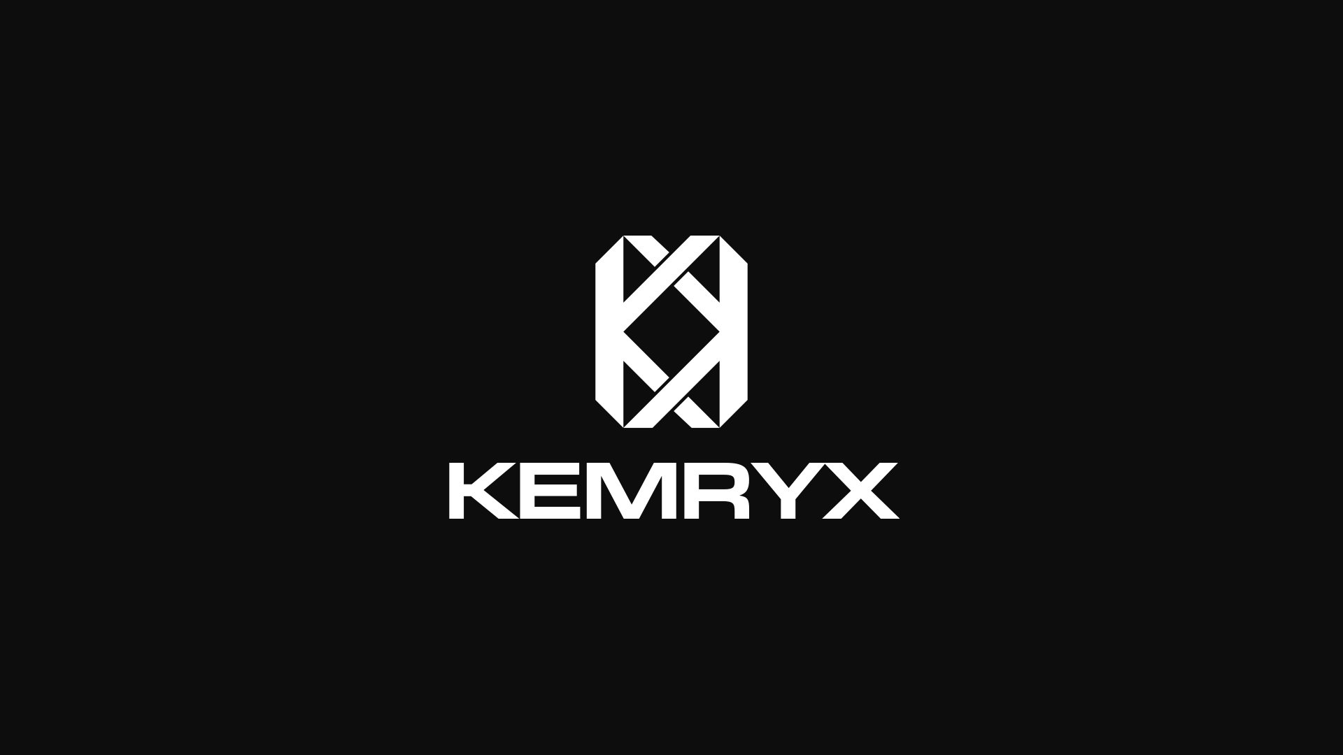
A K, turned, that crosses into an X.
The mark took five days and around fifty sketches on paper. I started with research into what makes a mark hold up small, sketched, narrowed the sheet to three, then to one, and built it in Adobe Illustrator, with ChatGPT helping me through the Illustrator workflow.
It is a K for KEMRYX, rotated by 180 degrees and laid over itself. Rotated, not mirrored: a turn is closer to transformation, which is what the name is about. Where the strokes of the two K’s cross, X shapes appear, so the mark reads as two K’s and two X’s. The diamond in the center was not planned. It came out of the construction, and I only saw what it was, one of the oldest shapes in alchemy, once the mark was finished. K and X are intent; the diamond is a find.

Everything sits on one grid: an octagonal outline with 45-degree chamfers, bars of one stroke weight S, about 18 percent of the width, only straight edges and 45-degree diagonals, and the tips of the diamond exactly on the inner edges of the vertical bars. The mark is monochrome by rule, pure white or pure black, never a palette tone.
Two alternatives were rejected. A squarer version generated with ChatGPT reads the left K more clearly but shrinks the diamond and pushes it off center, and its bars are not equal. Two simplified small-size variants, constructed in the original grid, lost the diagonal weave that makes the mark. Instead of a second, responsive form, small sizes follow a container rule: below 32 pixels the mark sits on a solid square or circle in #0D0D0D, filling it almost completely. Clear space is one stroke weight all around, measured from the outer edge of the octagon.
Wordmark
Drawn twice, rejected twice, then set in New Science.
I first tried to draw the wordmark out of the mark’s own grid: three variants in an octagonal, a cut and a blade style, then a second round with the K and the X on exact 45-degree diagonals. Both rounds went out. They looked blocky, and I did not have the experience to draw a wordmark to a professional standard in Illustrator. The AI-generated alternatives convinced me even less.
So the wordmark is set in a licensed typeface. The shortlist was decided by one letter, the R: angular, not round, with a straight leg. New Science Extended Bold by Newlyn passed and stayed my favorite, wide and square, angular where the rounder candidates were not. Miles Newlyn allowed us to use the artwork developed with the trial at no cost; a webfont license would be needed only if the font itself went online. The wordmark therefore exists as outlines, taken straight from the font file, and the typeface is used nowhere else.

The lock-ups follow the mark’s grid. Every size and gap is a multiple of the stroke weight S: cap height 2 × S, gap 1.25 × S, tracking −0.045 em, in the stacked and in the horizontal version. The first stacked version used a cap height of 1.5 × S, and the mark dominated it, so both lock-ups now share the same cap height. Stacked is the main form, for covers, outros and square formats; horizontal is for banners, headers and the press kit.


Color system
Five values. Black is the raw material, off-white the light, orange the product.
The palette is five values and nothing derived from them. Base and Surface carry around 85 percent of any layout, Off White about 10, Orange about 5. Orange appears where something happens, a drop, a change, a focus point, a call to action, never as decoration and never as a fill. That ratio is the actual link to the story: not the hue, but how the colors relate.
- Base#0D0D0DBackground, video
- Surface#1A1A1ACards, sections
- Off White#F2F2F0Text, headlines
- Accent#FF6600About 5 percent
- Muted#8C8C8ASecondary text, lines
#FF6600 replaced two almost identical oranges from the first draft. The last three candidates sat within two degrees of hue; the deciding argument was the short form #F60, identical in CSS and in Affinity and hard to mistype. Muted was added because Off White alone had been carrying text, lines and secondary text at once. Chrome and silver, part of an early direction, were dropped because neither of us liked the material.
One rule protects the palette: no brown. Darkened or transparent orange reads as brown on a dark ground, so there is no orange below full opacity, no orange gradient and no darkened orange as a second value. Gradients run only from Base to Surface, and hover states invert instead of tinting. Off White on Base measures 17.3:1, Muted on Base 5.8:1, Orange on Base 6.6:1. Orange on Off White measures 2.6:1 and is never used for text. The palette was tested on a cover, a 4:5 post, a 16:9 thumbnail and a website hero before it was frozen.
Typography
New Science for the wordmark, Archivo for everything else.
New Science is the wordmark and nothing else. Every other text is Archivo, licensed under the SIL Open Font License: Regular and Bold for body text, website and press kit; Black and ExtraBold for reel subtitles, where the large x-height and open forms hold up on a phone; Archivo Expanded, upright, in 700 and 800 for headings; Archivo Expanded Italic for captions, kickers and small labels. One family with a width axis covers all of it, and the wide cuts pick up the proportion of the wordmark without a second display face.
Inter was my starting point and went out for reading like software. Montserrat went out for being overused, with softer terminals. Helvetica Neue went out for lacking a license without a Creative Cloud subscription. The type scale has eight steps from a 64-pixel display to a 12-pixel caption, and the brand manual is set in it, so the manual is also the specimen.
Applications
One brand element per asset, and no mandatory layout.
There is no template system. The rule is that one brand element appears on every visual, and only one: the mark, a lock-up or the wordmark. Where and how large is decided by the format and the motif. Posts carry the mark bottom left at 8 percent of the width, stories and reels bottom center at 5.5 percent, thumbnails top right at 12 percent, self-released covers the stacked lock-up bottom center at 46 percent. In video the mark is a watermark in a corner at 6 percent of the frame height and 60 to 70 percent opacity; the outro shows the stacked lock-up centered at full opacity.

The kit is version 3.0. An internal package with 281 files and a hand-off package with 208 for labels, printers and partners hold every element in white, black and orange as SVG, PDF and PNG, app icons from 16 to 1024 pixels, the social set, the color tokens as CSS, JSON and an ASE swatch file, a 29-page manual, an 8-page logo guideline and a quick reference in HTML. A logo animation, 2.2 seconds at 30 fps with the two K’s arriving on the 45-degree axis and the diamond standing at the end, exists as ProRes 4444, WebM with alpha and MP4.
Result
Decided, filed, and waiting for December.
The identity was complete on 2 September 2026 and the kit followed a day later. Tobi signed off on the mark and on the stories behind name and logo. Publicly, the artist is still Latsge; KEMRYX, its handles and the mark go live on 2 December 2026 with the official post, a reel two days later and the first release the week after. Until then the kit is written as if the brand had already started, so nothing has to change on launch day.
What I take from it is the thing this site is about: a name, a mark, five colors and two typefaces that belong to the same music. The open items are the press pictures, the profile photo and the imprint for the website. None of them touches the system.